Near + Far
branding + print design
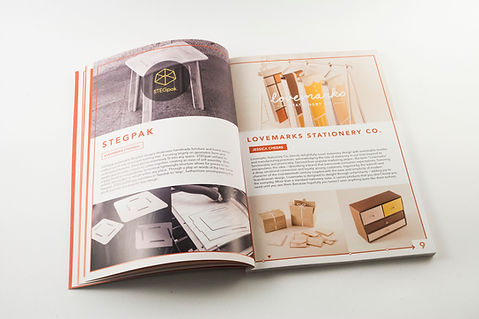
Near + Far was a proposal for the 2014 QUT Interactive and Visual Design graduate exhibition, designed to evolve in the months leading up to the exhibition. The proposal was ultimately selected by the graduating cohort, and I became the branding and print design manager for the remainder of the project, responsible for the design of the takeaway magazine and the direction of branding and visual material.
Project Manager: Nathan Pitt
Assistant Graphic Designer: Paige Talbot
Photographer: Anthony Hearsey
The concept
As design graduates it is imperative that we are always looking forwards, not only to our personal and career aspirations, but to the future of the design industry and our ever-changing role as creatives. However, we must also remain grounded in the present – in what we’ve learned, created and achieved – and how it has shaped our perspective.
Near + Far is a celebration of these two parallels: present and future, fine detail and big picture, individual and collective. As emerging designers it is often difficult to bridge the gap between the two, however in doing so we gain a sense of perspective that is incredibly beneficial to our practice. Ultimately, it is this sense of real-world perspective that differentiates creativity from innovation.


